20-somethings are seemingly only good at two things: killing, and lying about killing.
Liars at a Houseparty is a web-based murder mystery game where users uncover who killed "showboat Liz" at her own party.
DESIGN OPPORTUNITY
Develop a responsive web-based product (HTML/CSS/JS) with a linear user experience, an aspect of gamification, and a corresponding brand design.
DURATION
6 Weeks
TYPE
Personal/School Project
SOLUTION
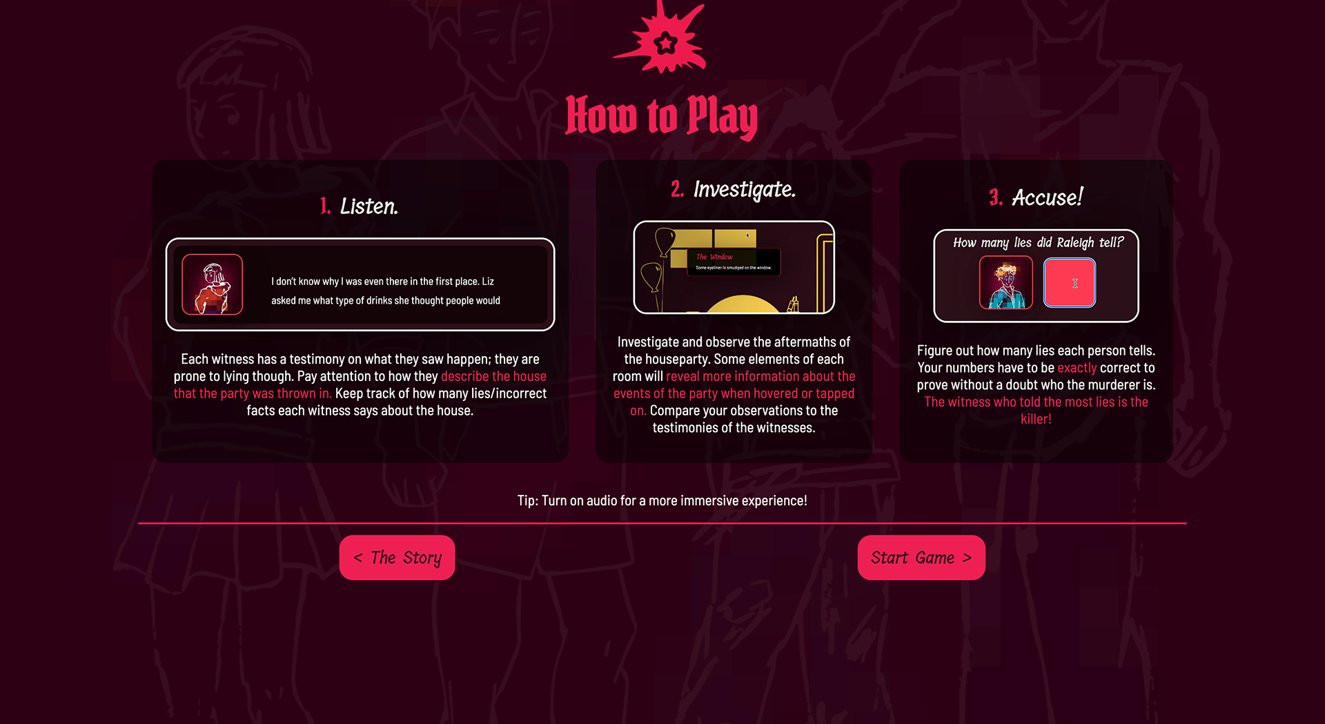
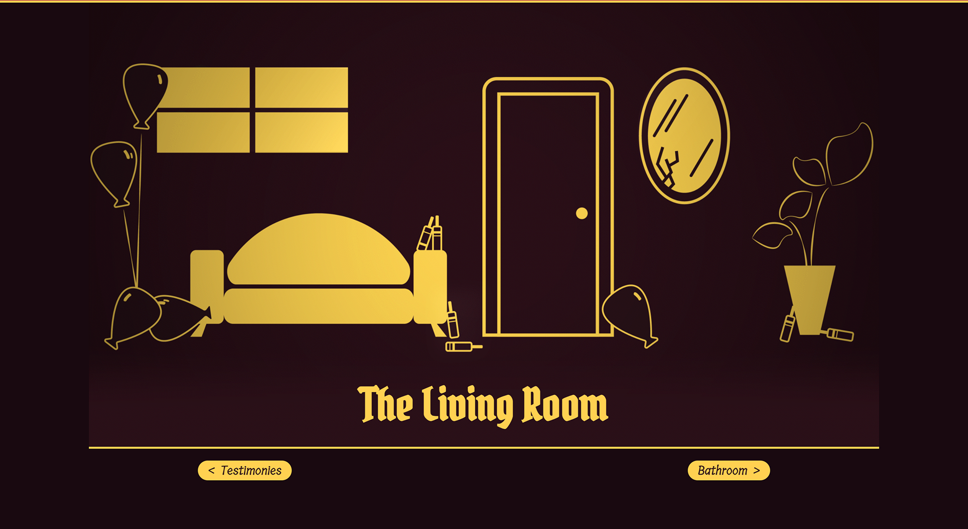
Through a point-and-click adventure, uncover who killed Liz by listening to testimonies and investigating the aftermaths of her house.
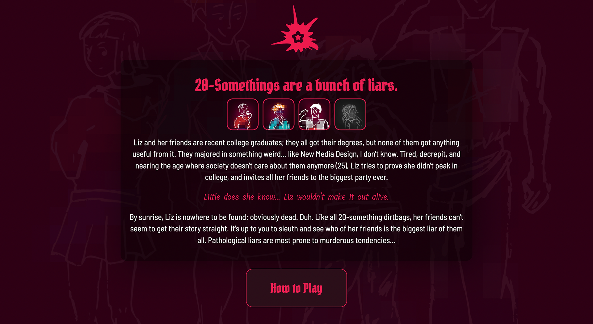
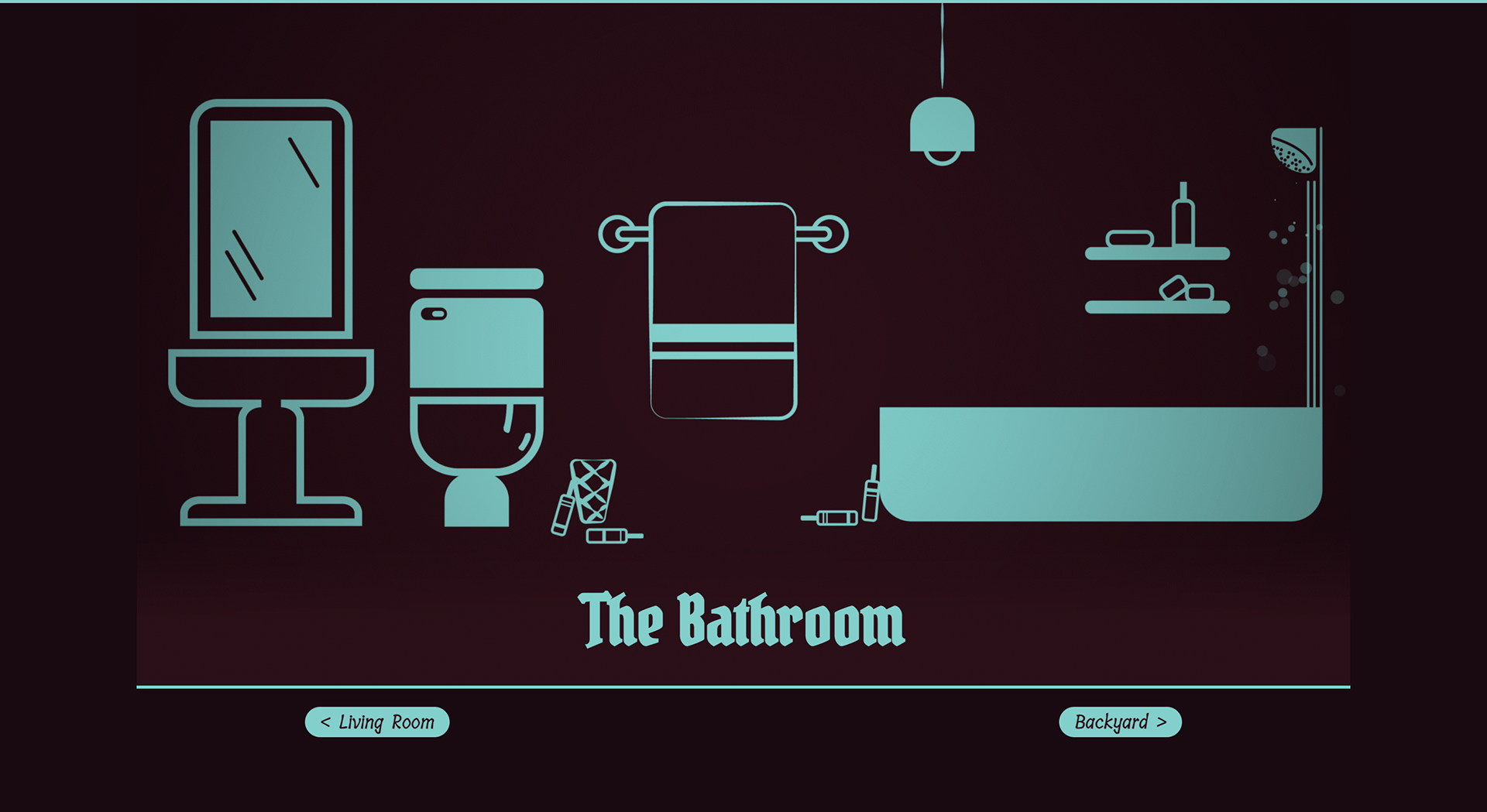
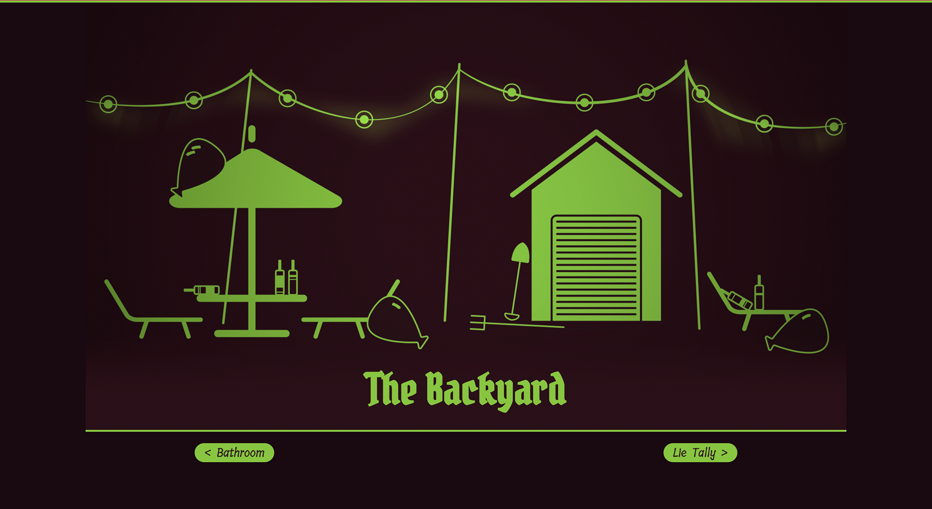
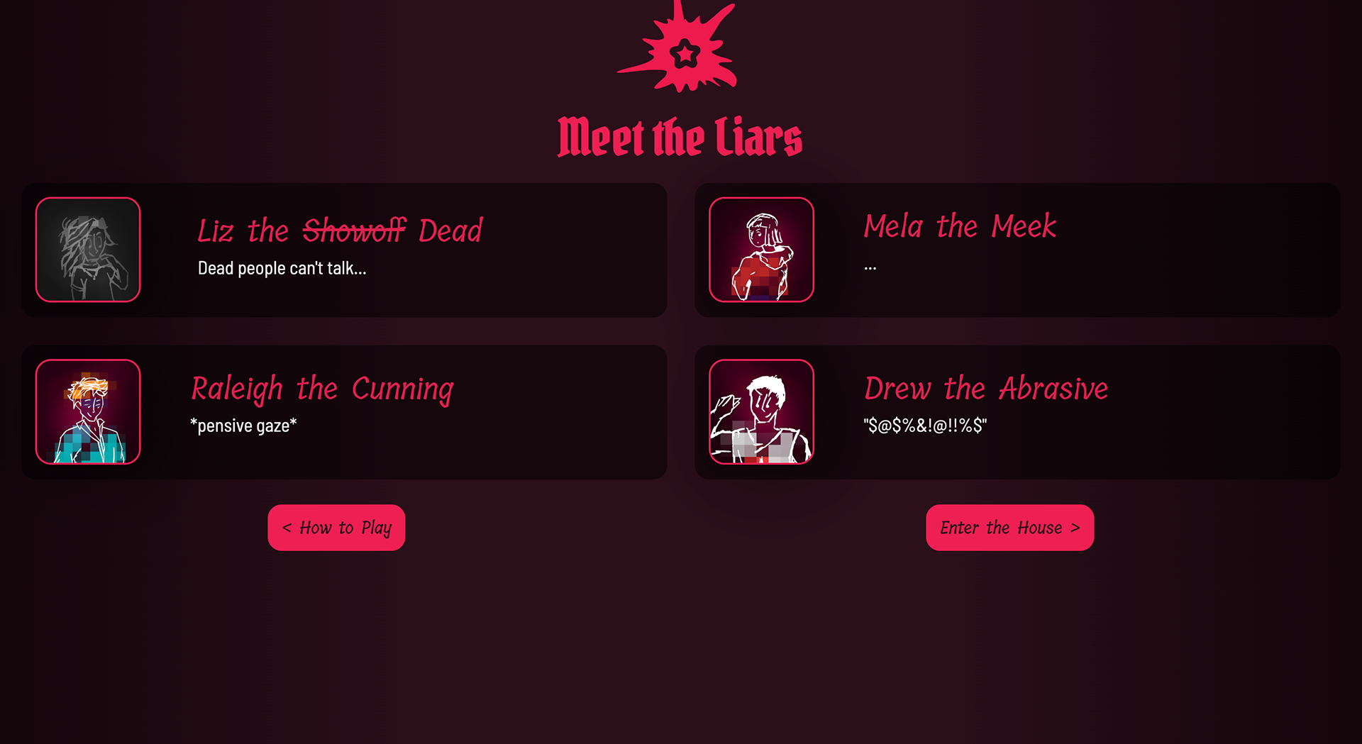
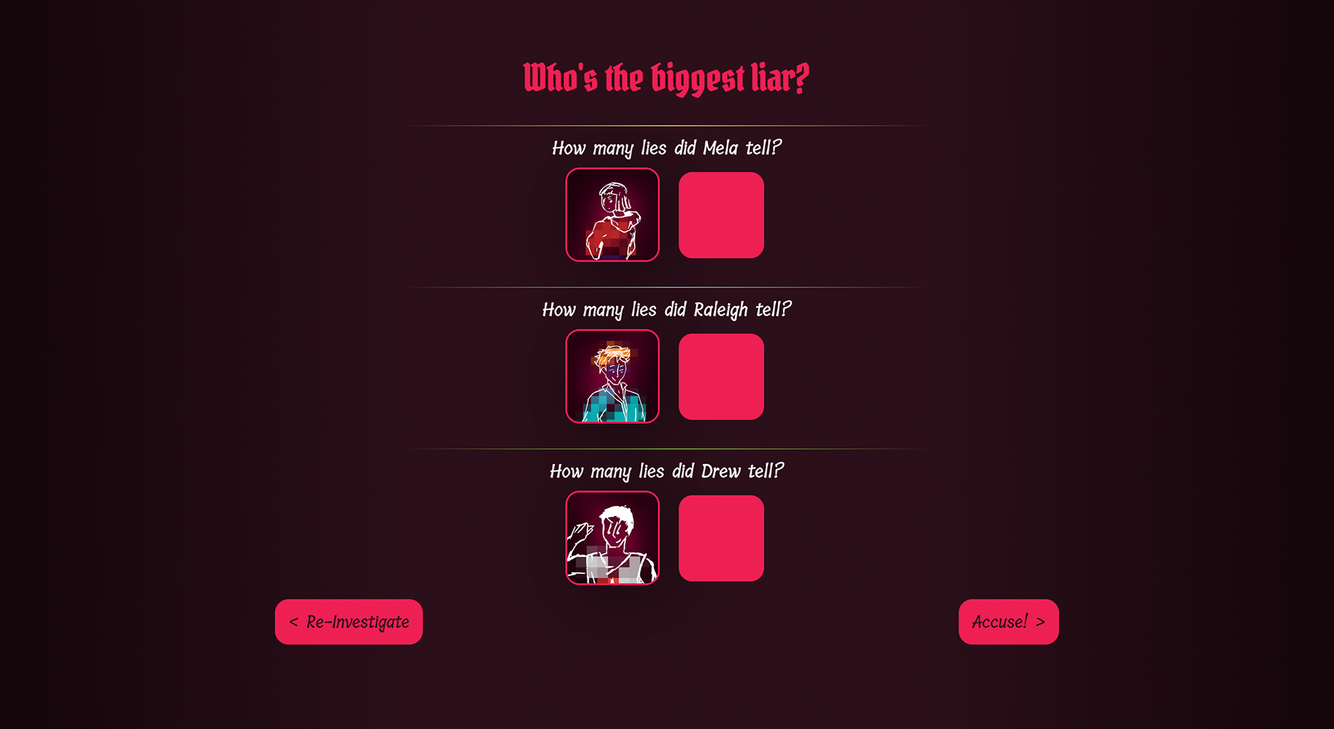
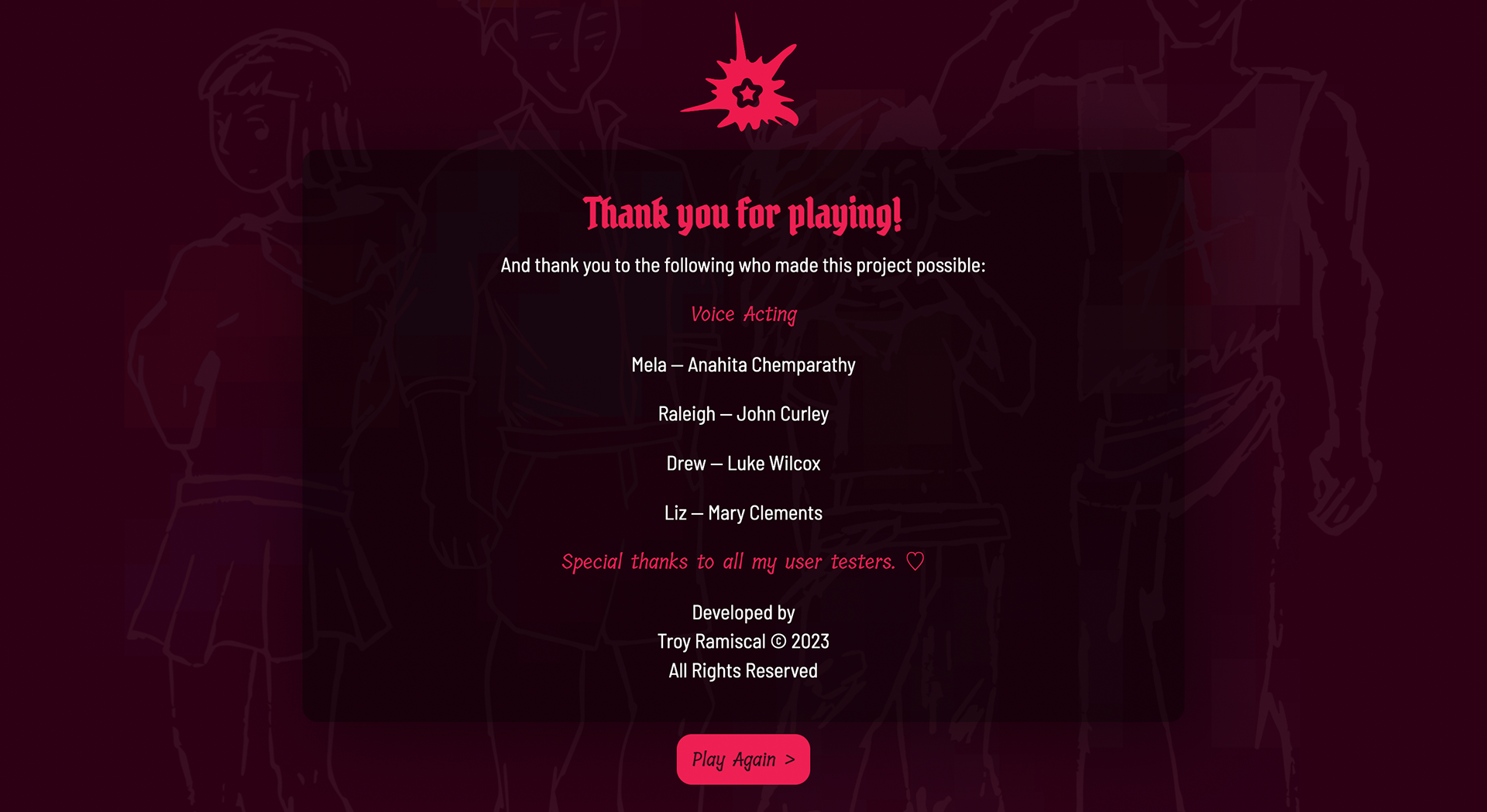
How can a linear experience keep a user engaged from point A to B?
Drawing from titles like Clue and Danganronpa, the design integrates distinctive character and brand elements to enrich the overall user experience.
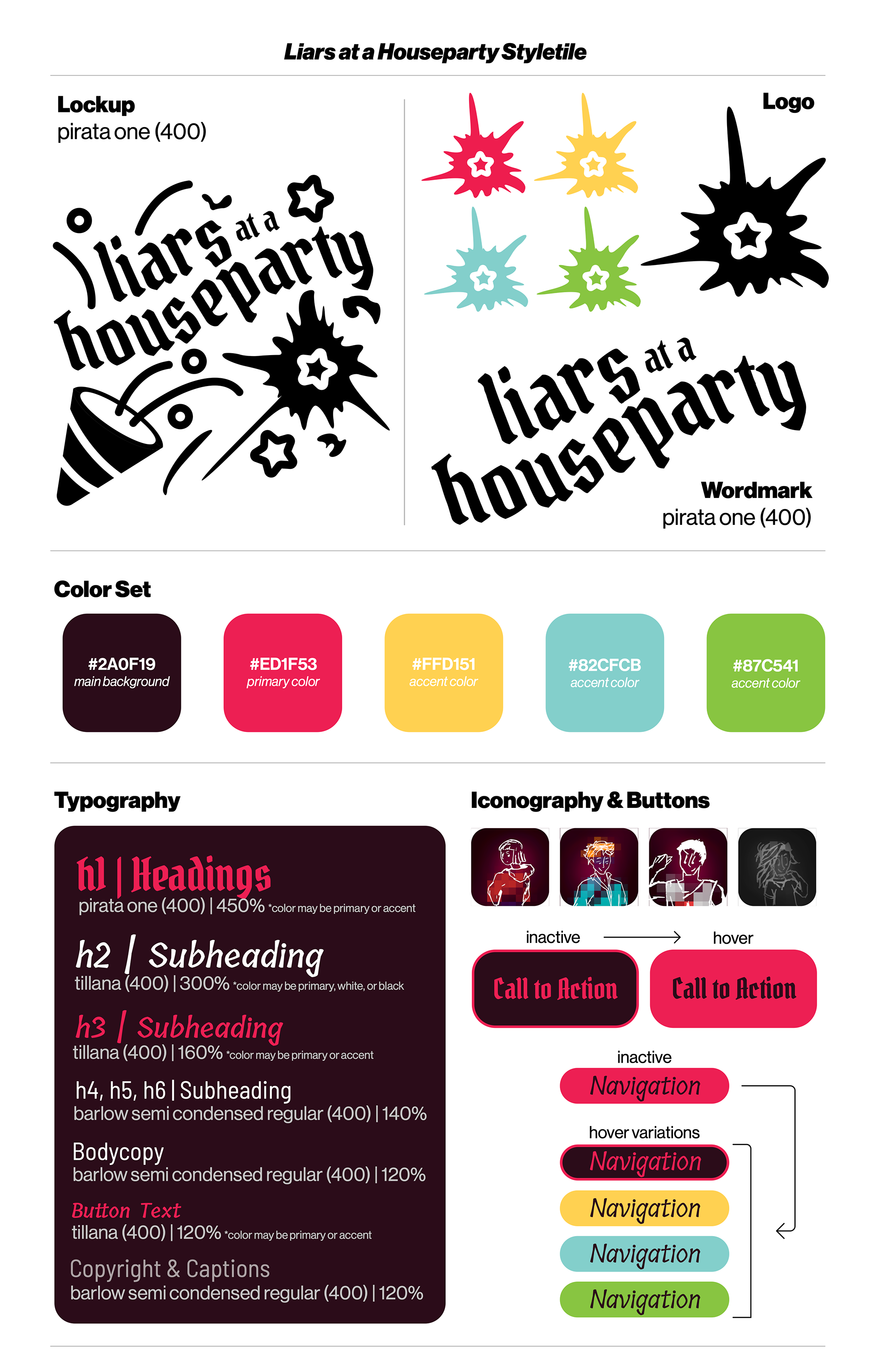
Develop branding with immersion in mind.
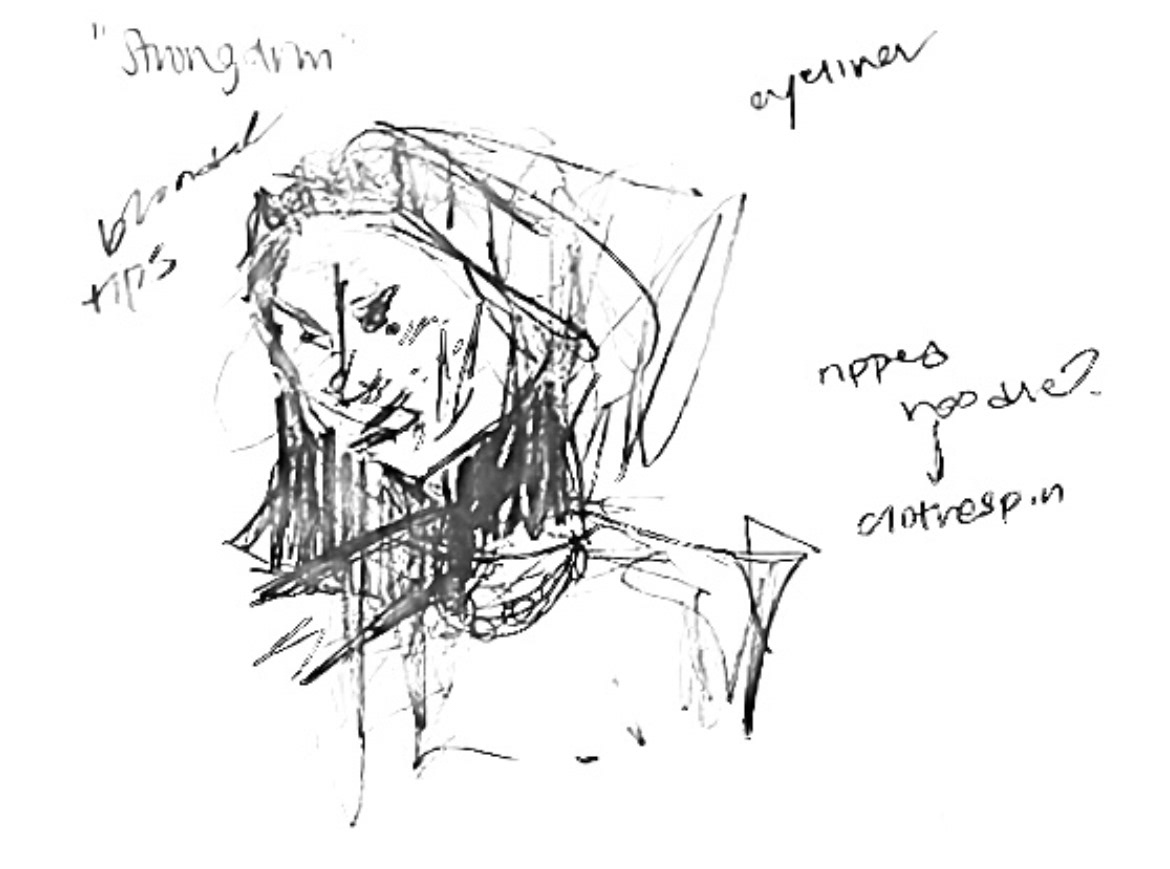
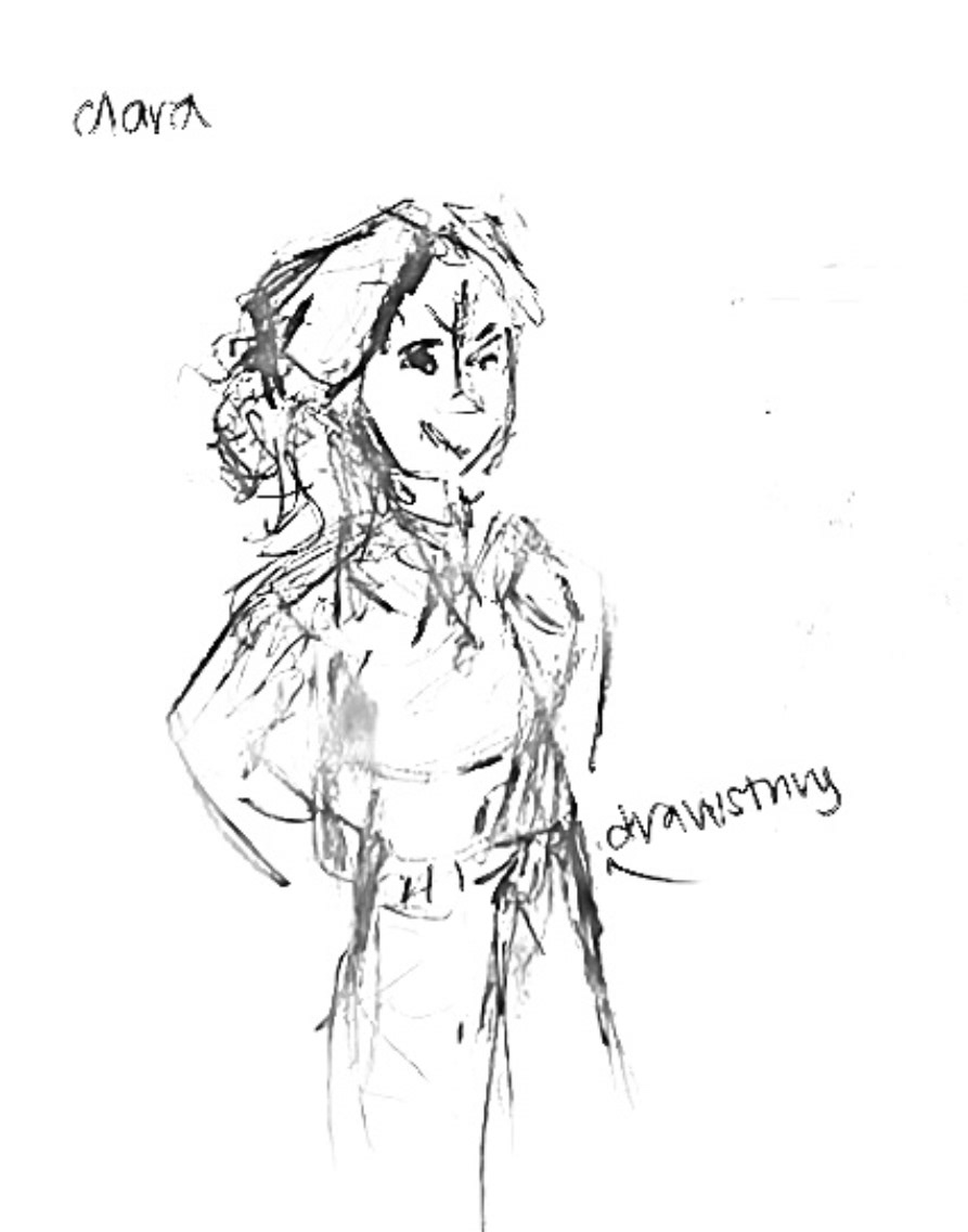
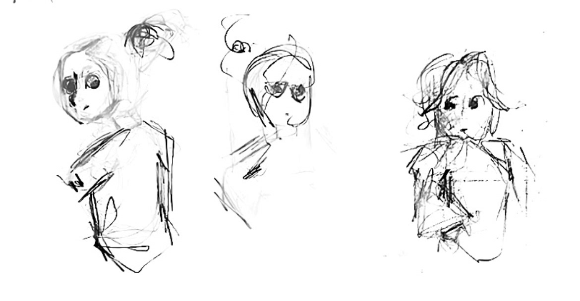
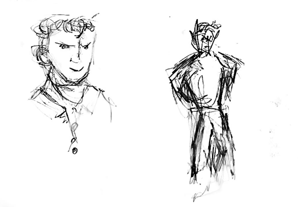
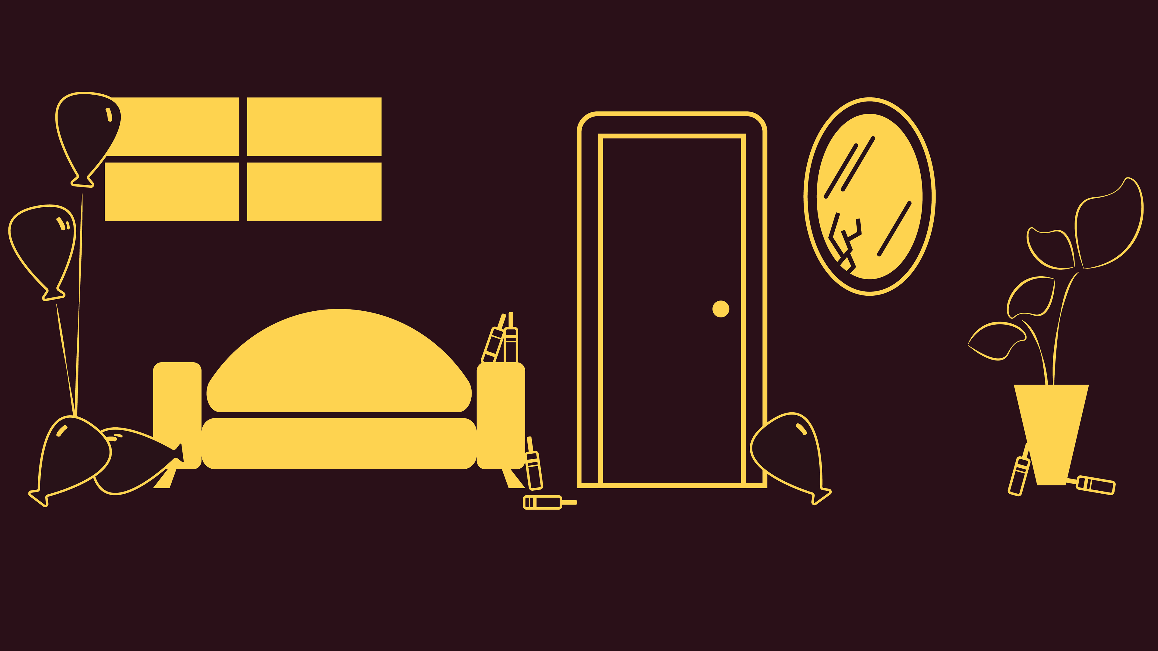
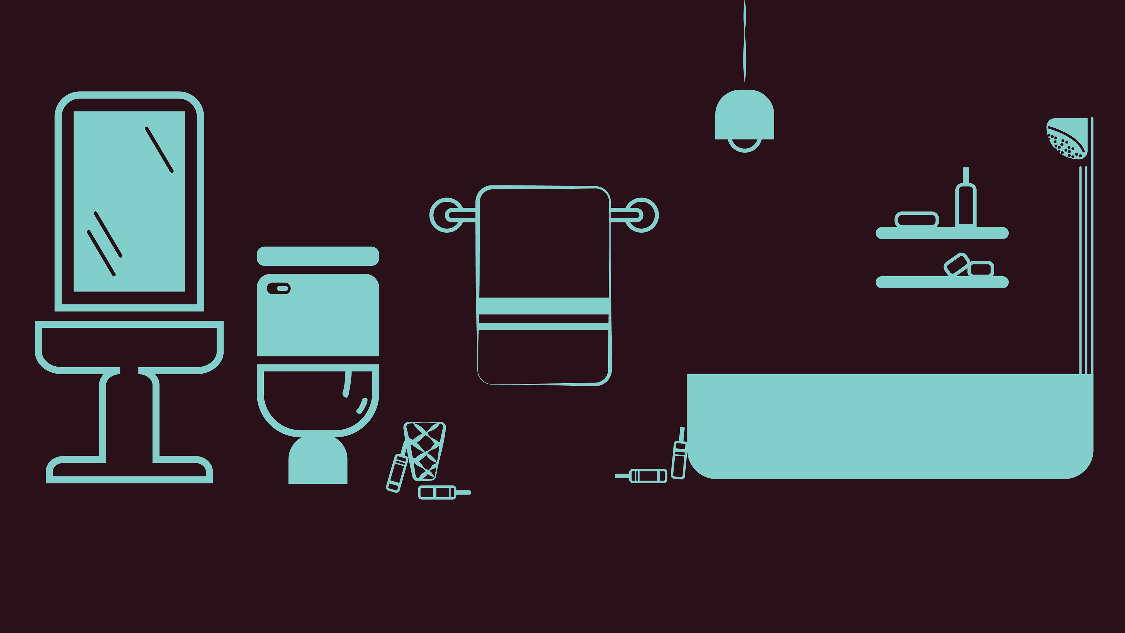
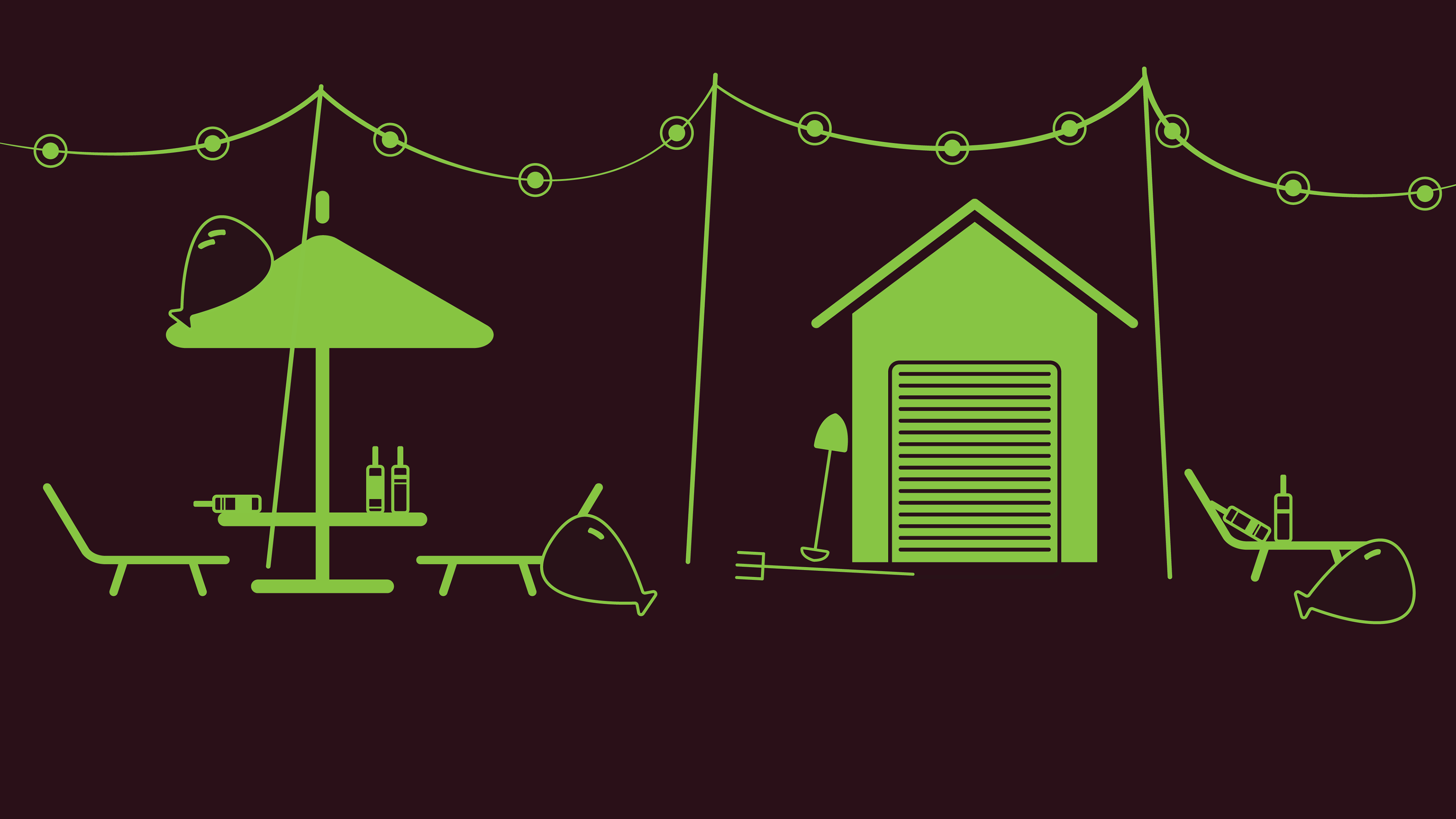
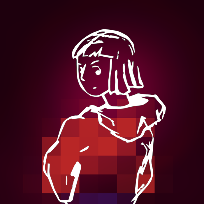
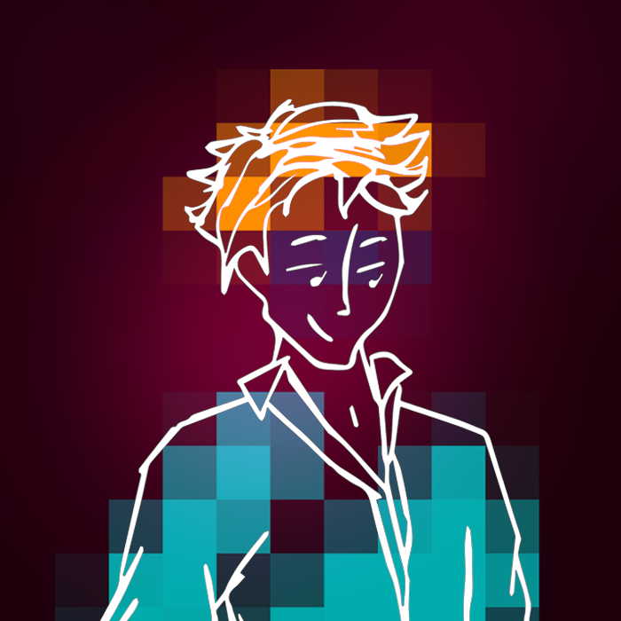
To establish a clear visual direction, I began by designing the game’s rooms using simple, scalable vectors that could easily integrate with CSS. Once the environment was set, I worked on the character designs to enhance the narrative.

First Iteration of the Lockup

Final Lockup
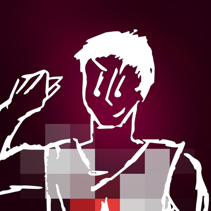
Drew

Liz
Mela
Raleigh
The UI should string the user forward and backward.
After multiple iterations and user testing, I refined the interaction design to improve clarity and engagement. Initially elegant but confusing "hidden clues" were redesigned for better responsiveness. Without visual prompts, most users would skip all the screens before getting to the end.
The final accusation screen evolved from simple multiple choice to having to specify the number of lies per character, increasing user involvement and reducing guesses.

Takeaways
Doing a product design from start to finish allowed me to understand that every part of the design process would have immense influence on each other. Notably, seeing how my user flows had to change in order to spotlight storyline and character design was something that I didn't expect, especially considering I didn't think much variability was possible in a linear user experience.
If I were to do a similar project, I would framework the structure of the website with CSS grid and more JavaScript to make the responsive features were more equitable across viewports. In this 6 week design sprint, I was able to understand what features of the product had to be prioritized in order to have a finished design.
